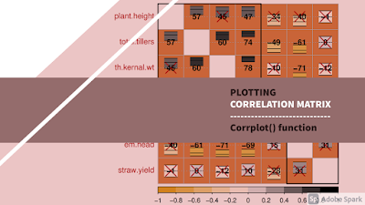
Plotting correlation matrix | corrplot() function | Rstudio
 |
| See Video ⮞ ☝ |
AGRON stats
March 21, 2021
Introduction
In this tutorial you will learn how to get a graphical display of correlation matrix using corrplot() function in Rstudio. So lets get started!
As a first step, I always recommend to clear data objects and values in global environment with rm() function. Set TRUE value for the argument all to remove objects and values if you have created earlier. Shut down all the graphic windows by using graphics.off() function. Putting the value “cls” in shell() function will clear the console environment.
rm(list = ls(all = TRUE))
graphics.off()
shell("cls")
To import the excel file type read_excel() function. In this function the argument path specify location of the data file. Copy the path from the file explorer and paste it in quotations. Change the backslash to forward slash as in R you cannot you backslash to locate the file. After adding a forward slash at the end of the path, just press tab button on keyboard to access the files present in that location. Select the respective data file and press enter to choose it. If we type TRUE in header argument then it indicates the R will import data file including the variable names as first row in data set.
Use attach() function for the object data to mask its components. By this you can simply access the variables by just typing the name of the variable.
Output
# # A tibble: 3 x 10
#     rep method priming e.head h.mat p.height t.tillers t.ker.wt k.yield st.yield
#   <dbl> <chr>  <chr>    <dbl> <dbl>    <dbl>     <dbl>    <dbl>   <dbl>    <dbl>
# 1     1 conv   NP          88    35      113       445      9.9    3.46     12.9
# 2     1 conv   HP          92    27      126       498     12      3.58     13.3
# 3     1 conv   OP          83    27      118       535     15.7    3.61     13.9
Code
library(readxl)
data = read_excel(
          path = "E:/Correlation analysis/data_corr.xlsx",
          col_names = TRUE
)

attach(data)
head(data, 3)
Correlation analysis
Now lets proceed further to get a correlation matrix with probability values using agricolae package. Create an object data.cor and assign the output on the right side by using assignment operator or equal sign. Whatever the function we shall write on the right side, its output will be assigned to this object. We shall use correlation() function to get a matrix of correlation values. In this function the argument x specify either a vector of response variable or a matrix of variables for which we are interested to see the association. The first three variables in this data set are categorical or factor variables so I am giving the range of response variables from 4th to 10th variable. In method argument set the value for correlation method to be used. The alternative argument specify the alternative hypothesis as here in this example I am using two.sided hypothesis.
The print() function will return the output of the correlation function. We can see the output contains correlation values, probability values and number of observations.
Output
# $correlation
#           e.head h.mat p.height t.tillers t.ker.wt k.yield st.yield
# e.head      1.00  0.15    -0.40     -0.61    -0.71   -0.69     0.31
# h.mat       0.15  1.00    -0.34     -0.49    -0.10   -0.43    -0.28
# p.height   -0.40 -0.34     1.00      0.57     0.45    0.47    -0.01
# t.tillers  -0.61 -0.49     0.57      1.00     0.60    0.74     0.00
# t.ker.wt   -0.71 -0.10     0.45      0.60     1.00    0.78    -0.12
# k.yield    -0.69 -0.43     0.47      0.74     0.78    1.00     0.10
# st.yield    0.31 -0.28    -0.01      0.00    -0.12    0.10     1.00
#
# $pvalue
#                 e.head      h.mat   p.height    t.tillers     t.ker.wt
# e.head    1.0000000000 0.54026966 0.09701049 0.0074434513 0.0009087942
# h.mat     0.5402696631 1.00000000 0.16747034 0.0379123294 0.6874722478
# p.height  0.0970104894 0.16747034 1.00000000 0.0129596892 0.0617512187
# t.tillers 0.0074434513 0.03791233 0.01295969 1.0000000000 0.0089586967
# t.ker.wt  0.0009087942 0.68747225 0.06175122 0.0089586967 1.0000000000
# k.yield   0.0016517901 0.07752274 0.04972248 0.0004291801 0.0001369208
# st.yield  0.2072882086 0.26710622 0.96456396 0.9985718607 0.6340391279
#                k.yield  st.yield
# e.head    0.0016517901 0.2072882
# h.mat     0.0775227402 0.2671062
# p.height  0.0497224848 0.9645640
# t.tillers 0.0004291801 0.9985719
# t.ker.wt  0.0001369208 0.6340391
# k.yield   1.0000000000 0.6913522
# st.yield  0.6913521760 1.0000000
#
# $n.obs
# [1] 18
Code
library(agricolae)
data.cor = correlation(x = data[, c(4:10)],
                       y = NULL,
                       method = "pearson",
                       alternative = "two.sided")

print(data.cor)
Plotting correlogram
Now let’s proceed further and plot a correlogram to highlight the most correlated values in a data table. For graphical display of the correlation matrix we shall use corrplot package. Load this package by using library function. Let’s plot a simple matrix first. We shall use corrplot() function to plot correlation matrix. In this function, the argument corr specify a correlation matrix. We can type the object data.cor that contains the output of the correlation analysis. When you will type dollar sign after this object it will show the components. Select correlation component so that correlation values could be plotted. When we shall run this command it will result in a simple graphical display of correlation values.
Output

Code
library(corrplot)
corrplot(
          corr = data.cor$correlation
)
Now lets make it more attractive and useful by adding different arguments.
The argument “method”
The argument method specify a character value indicating a method that will be used for visualization of correlation matrix. Currently this argument specify seven methods; “circle”, “square”, “ellipse”, “number”, “pie”, “shade” and “color”.
The areas of circles or squares show the absolute value of corresponding correlation coefficients.
Output


Code
corrplot(
          cor = data.cor$correlation,
          method = "circle",
# method = "circle", "square", "ellipse", "number", "pie", "shade" and "color"

)
The argument type
You can customize the display of the graph by using type argument. This argument requires a character value full, upper and lower. The value “lower” for this argument will display the lower triangular matrix. Typing upper as value for this argument will display the upper triangular matrix. The value “full” which is default value for this argument display both upper and lower triangular matrix.
Output


Code
corrplot(
          cor = data.cor$correlation,
          method = "circle",
          type = "lower"
# type = "full", "lower", "upper"

)
The argument order
We can set the ordering method of the correlation matrix by using order argument. For angular order of the eigenvectors we can set AOE as value for this argument. For displaying the order of first principal component we can set the value FPC for this argument. For displaying hierarchical clustering order we can set hclust as value for this argument. To display the alphabetical order we can set “alphabet” as character value for this argument.
Output


Code
corrplot(
          cor = data.cor$correlation,
          method = "circle",
          type = "lower",
          order = "AOE"
# order = "AOE", "FPC", "hclust", "alphabet"

)
You can set a different color for coefficient values in the graph. Here I am just changing the values for method and order argument. To change color of the correlation coefficient values, use addCoef.col argument. This will add color of the coefficients on the graph.
You can also translate coefficient values into percentage style for space saving. Setting logical value TRUE for addCoefasPercent argument will display percentage style. There is no need to display the correlation coefficients on the diagonal of the graph. We can do this by setting FALSE as value for diag argument.
Output


Code
# Show correlation coefficients
corrplot(cor = data.cor$correlation, method = "circle", type = "lower", order = "AOE",
         addCoef.col = "black", diag = FALSE,
)
# Translate Coefficients into percentage
corrplot(cor = data.cor$correlation, method = "circle", type = "lower", order = "AOE",
addCoef.col = "black",
addCoefasPercent = TRUE, diag = FALSE,
)Customizing color palettes
We can customize the color of the glyphs if you feel the default color is not attractive. First, load the “ggsci” package using library() function. In col argument we can set different themes of color palettes from the loaded package. Just set the value for number of colors (n) to be in the palette and alpha transparency level in the range from 0 to 1.
Select the color scheme that you think is most attractive.
Output


Code
library(ggsci)
# Select color scheme from ggsci package
corrplot(cor = data.cor$correlation, method = "circle", type = "lower", order = "AOE", addCoef.col = "black", diag = FALSE,
         col = hcl.colors(
                          n=10,
                          alpha = 0.8
                          )
# col = "hcl.colors", "heat.colors", "terrain.colors", "topo.colors"
)
However, if you are not comfortable with the default color palettes then you can customize your own color scheme by using colorRampPalette() function.
This function interpolates a set of given colors to create new color palettes. Here, I am specifying three colors. Now in color argument set my_pal and define the number of colors to be in the palette. I am ok with \(200\) as number but you can specify a different value.
To plot an outline around the glyphs you can set TRUE as logical value for outline argument.
Output


Code
# Apply color palette
corrplot(cor = data.cor$correlation, method = "circle", type = "lower", order = "AOE", addCoef.col = "black", diag = FALSE,
         col = my_pal(n=200),
)
# Outline around glyphs
corrplot(cor = data.cor$correlation, method = "circle", type = "lower", order = "AOE", addCoef.col = "black", diag = FALSE, col = my_pal(n=200),
outline = TRUE,
)Color label position
Further, you can change the position of color labels by using cl.pos argument. Setting “r” as character value for this argument will display color label on right side of the graph. Setting “n” as character value for this argument will remove the color label of the graph. The value “b” will display the color label at the bottom of the graph.
Output


Code
# color label right
corrplot(cor = data.cor$correlation, method = "circle", type = "lower", order = "AOE", addCoef.col = "black", diag = FALSE, col = my_pal(n=200),
         cl.pos = "r"
)
# color label bottom
corrplot(cor = data.cor$correlation, method = "circle", type = "lower", order = "AOE", addCoef.col = "black", diag = FALSE, col = my_pal(n=200),
cl.pos = "b"
)# color label null
corrplot(cor = data.cor$correlation, method = "circle", type = "lower", order = "AOE", addCoef.col = "black", diag = FALSE, col = my_pal(n=200),
cl.pos = "n"
)Background color
Lets change the background color of the graph to make it more attractive. I am using a hex code for the color of my choice but you are free to choose any. After setting value for bg argument, the graph now looks more appealing than it was before.
Output

Code
# HEX code = #FF7D33
corrplot(cor = data.cor$correlation, method = "circle", type = "lower", order = "AOE", addCoef.col = "black", diag = FALSE, col = my_pal(n=200), cl.pos = "b", title = "Background color", mar=c(0,0,1,0),
         bg = "#FF7D33"
)
Text label rotation
If you want to change the rotation of the text label string, you can do this by using tl.srt argument. Setting rotation angle values in degrees will change the rotation of the text label string.
Output

Code
# HEX code = #FF7D33
corrplot(cor = data.cor$correlation, method = "circle", type = "lower", order = "AOE", addCoef.col = "black", diag = FALSE, col = my_pal(n=200), cl.pos = "b", title = "Text label rotation", mar=c(0,0,1,0), bg = "#FF7D33",
         tl.srt = 0
)
The argument addrect
In some cases when you are working with distance measuring techniques and also you want to group the correlation coefficients according to the number of clusters. You can do this by using addrect argument. Again I am going to set the value for method argument as circle as I have seen the circular glyphs are more attractive than the square shapes. Also you need to change the value for order argument. You can draw rectangles only when the order is set to “hclust” and rectangles will be added according to the hierarchical clusters.
In addrect argument set the value in numbers representing the number of clusters. If you are not familiar with this technique and doesn’t know how to measure the number of clusters then go through the suggested video. I shall put the link of this video in the description. You can also specify the agglomeration method to be used when the order is “hclust”.
Further, the color of the rectangles can be changed using rect.col argument.
Output


Code
corrplot(cor = data.cor$correlation, method = "circle", type = "full", addCoef.col = "black", diag = FALSE, col = my_pal(n=200), cl.pos = "b",
         order = "hclust",
         addrect = 3,   # Add rectangles
         rect.col = "red"  # Rectangle color
)
Add confidence interval
Apply test to get CI
First we need to apply a significance test which will produce confidence interval along with p-values for each variable. We can do this by using cor.mtest() function. In this function the argument mat specify the range of variables. Also specify conf.level as it is 0.95 for 5 percent significance level. Print this command and it will show the output as matrix of probability values, and upper and lower bounds of the confidence interval.
Output
# $p
#              [,1]       [,2]       [,3]         [,4]         [,5]         [,6]
# [1,] 0.0000000000 0.54026966 0.09701049 0.0074434513 0.0009087942 0.0016517901
# [2,] 0.5402696631 0.00000000 0.16747034 0.0379123294 0.6874722478 0.0775227402
# [3,] 0.0970104894 0.16747034 0.00000000 0.0129596892 0.0617512187 0.0497224848
# [4,] 0.0074434513 0.03791233 0.01295969 0.0000000000 0.0089586967 0.0004291801
# [5,] 0.0009087942 0.68747225 0.06175122 0.0089586967 0.0000000000 0.0001369208
# [6,] 0.0016517901 0.07752274 0.04972248 0.0004291801 0.0001369208 0.0000000000
# [7,] 0.2072882086 0.26710622 0.96456396 0.9985718607 0.6340391279 0.6913521760
#           [,7]
# [1,] 0.2072882
# [2,] 0.2671062
# [3,] 0.9645640
# [4,] 0.9985719
# [5,] 0.6340391
# [6,] 0.6913522
# [7,] 0.0000000
#
# $lowCI
#            [,1]       [,2]         [,3]       [,4]        [,5]         [,6]
# [1,]  1.0000000 -0.3365895 -0.732281332 -0.8371702 -0.88493883 -0.873441607
# [2,] -0.3365895  1.0000000 -0.696322700 -0.7799543 -0.54293118 -0.745048513
# [3,] -0.7322813 -0.6963227  1.000000000  0.1446728 -0.02289482  0.002442419
# [4,] -0.8371702 -0.7799543  0.144672818  1.0000000  0.17982749  0.419942648
# [5,] -0.8849388 -0.5429312 -0.022894816  0.1798275  1.00000000  0.491494328
# [6,] -0.8734416 -0.7450485  0.002442419  0.4199426  0.49149433  1.000000000
# [7,] -0.1811162 -0.6582405 -0.475646119 -0.4665145 -0.55604570 -0.384354771
#            [,7]
# [1,] -0.1811162
# [2,] -0.6582405
# [3,] -0.4756461
# [4,] -0.4665145
# [5,] -0.5560457
# [6,] -0.3843548
# [7,]  1.0000000
#
# $uppCI
#             [,1]        [,2]       [,3]        [,4]       [,5]        [,6]
# [1,]  1.00000000  0.57961304 0.07833134 -0.19691121 -0.3678828 -0.32326897
# [2,]  0.57961304  1.00000000 0.15083506 -0.03312069  0.3832114  0.05034627
# [3,]  0.07833134  0.15083506 1.00000000  0.82032688  0.7570305  0.76764292
# [4,] -0.19691121 -0.03312069 0.82032688  1.00000000  0.8317923  0.89760276
# [5,] -0.36788283  0.38321139 0.75703049  0.83179234  1.0000000  0.91381020
# [6,] -0.32326897  0.05034627 0.76764292  0.89760276  0.9138102  1.00000000
# [7,]  0.67993036  0.21882203 0.45800109  0.46722545  0.3670680  0.54198487
#           [,7]
# [1,] 0.6799304
# [2,] 0.2188220
# [3,] 0.4580011
# [4,] 0.4672254
# [5,] 0.3670680
# [6,] 0.5419849
# [7,] 1.0000000
Code
res.CI <- cor.mtest(
          data[4:10],
          conf.level = 0.95
)
print(res.CI)
Display CI in plot
Lets add this information to display confidence intervals in above command. The upper.mat argument specify the upper range of confidence interval values. The lower.mat argument specify the lower range of confidence interval values. To plot confidence interval set the value for plotCI argument. You can specify this argument by either using “circle” or “rect” as character string for this argument.
Output


Code
corrplot(cor = data.cor$correlation, method = "circle", type = "full", addCoef.col = "black", diag = FALSE, col = my_pal(n=200), cl.pos = "b", order = "hclust", addrect = 3, rect.col = "red",
         uppCI.mat = res.CI$uppCI,   # Upper CI
         lowCI.mat = res.CI$lowCI,   # Lower CI
         plotCI = "circle"
# plotCI = "circle", "rect"
)
Please comment below if you have any questions.
Download data file — Click_here
Download Rscript — Download Rscript
Download R program —
Click_hereDownload R studio —
Click_here


The top management team is overly optimistic about you and your abilities. The chairman of the board even calls you the "captain of the dream team."
ReplyDeletehttps://ppcexpo.com/blog/benefits-of-pareto-analysis